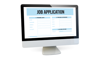
- Forms must be as short as possible
- Validate fields avoid showing errors to the user
- Fields must be sorted and grouped to help the user
- Forms must have visual aids
- Hide optional fields until be necessary
Usable Forms
Usable Forms help users solve their questions much easier. From simple registration forms to search forms they make finding answers much faster. Many websites include forms to deal with clients and their needs. Usable forms need to be as quick and easy to fill out as possible if not the user will just get bored halfway done and leave.
Before designing a form you should have clear what exactly you are expecting out of it? Once you have this then you need to think about the fields on your form make sure they are needed and that you don’t put them on just to fill up some space. Be specific with what you ask for.
For Example:
- Home Number:
- Cell Number:
- Fax Number:
Ask yourself am I really going to uses these numbers? Are you ever going to send your client a fax?
 How long can my form be?
The next thing to remember is that the longer the form is the less your client will fill it out. Long forms become boring and pointless this is why we should narrow down what exactly we want and what do you need. Ask things in a way people will understand like if you were asking them face to face don’t use big words, or technical words remember these are simple clients sometimes they won't know what you are talking about.
Ask yourself these questions before creating your form:
- What information do I need?
- Can a group some of that information together?
- Am I clear on what I am asking for?
 Drop down Menus
The best thing about drop-down menus is that they save lots of space on the screen but don’t make them that long. Make sure that if you offer your services or products outside the US you have options for other people as well.
For Example: You have a list of the states but what about the people that don’t live in the states?
In these menus keep the information that is alike together or try keeping some type of order between the options of the drop-down menu. (1,2,3 or A,B,C) If you see that some options are more common for your user then put them on the top so people don’t have to scroll down.
It is also recommended that if you have a really long list to choose from then try putting links.
For Example: You have a list of Word from A-Z, so the best thing is to put a type o navigation bar that will make things faster.
This way when people look for something they can search by the first letter and decide.
